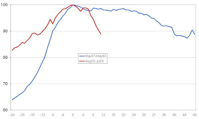
The blue line runs from May 1987 to May 1993, and the red goes from August 2005 to last month. The peaks are marked as month 0 on the X axis, and the percentage of peak value that prices are at is on the Y axis (both peaks count as 100%, although of course the 2007 one was much higher in actual money terms).

Two things are obvious: last time round, the rise was much faster (1988 in particular was crazy); and this time round, the fall is much faster (most notably the last five months).
A few numbers to illustrate: the total peak-to-trough fall back then, taking a full 45 months, was 12.7%. In the 11 months so far since the recent peak, prices have fallen 11.2%. If this month replicates July’s 1.7% drop, then that will equal the total 1989-93 fall.
The 11 months to July have wiped out 16 months of preceding rises; but last time round, the entire 45-month fall wiped out just nine months of pre-peak rises.
What puzzles me is why the much more sudden rise back then, which you might think would be less sustainable than the more gradual one this time, should result in a much gentler decline than the sharp downturn we now see. But perhaps I’m being a fool in even quarter-expecting rationality from the market
(I’d have liked to average the Halifax and Nationwide house price indices, as I did once before, to get a broader picture – but the Nationwide one only goes back to 1991.)

2 comments:
What puzzles me is why the much more sudden rise back then, which you might think would be less sustainable than the more gradual one this time, should result in a much gentler decline than the sharp downturn we now see.
I'm sure it's at least partly an example of the Feiler faster thesis (plus general doomandgloomism) - people who need to get out are getting out of the market quicker because they receive and process the information that they need to get out of the market quicker.
The housing market rose from '96 or '97, and since 2000 or 2001 was considered to be booming.
Could it be that the longer run up in prices means that the last two years has been relatively slow in comparison? Or simply that the relative gains were small on already high prices?
Post a Comment